
Gjensidige Integrates Design System with CMS
Discover how Gjensidige made their design system work smoothly with the Enonic platform for both editors and developers.
Gjensidige, Norway’s largest insurance company, is an established brand with over 200 years of history. Headquartered in Oslo, it employs over 4,000 staff across seven countries. The company focuses primarily on insurance, with around 350 technology specialists driving digital innovation.
The company’s technology division covers everything from insurance systems to cloud computing. Particularly noteworthy is the cross-disciplinary nature of the front-end application teams, where designers, editors, and developers work in sync.
Nowhere is this more apparent than in the design system of Gjensidige.
Challenges
Gjensidige wanted to integrate their design system with the Enonic platform and the content management tool Content Studio. All teams building digital solutions needed to operate similarly without any custom front-ends, regardless of CMS functionality and editorial content.
The Gjensidige design system started as a CSS file passed around the house for several years. This setup worked in a limited context, but was not viable in the long run.
The design system and the CMS had to be consonant with the Gjensidige developers’ preference for React and TypeScript. Other factors included full control of dependencies, environments, and code, as well as the need to develop components independently of the Enonic platform.
For the design system team, the integration of design system and CMS also posed a “luxury” challenge in three respects. First, the increased flexibility required more guidelines and best practices. Second, the existence of a dedicated team led to increased expectations among content editors for improvements.
Third, the team had to and must continuously turn down several wishes for tweaks in design and functionality, as they may affect all public pages and product teams. The team is a gatekeeper looking at the whole picture, which was made easier by the design system/CMS integration.
In 2022, Gjensidige began implementing a new corporate identity across the board. Every component of the design system had to be restyled. However, Gjensidige has many sites and themes, making it untenable that everyone would adopt the new design at the same time. Supporting users of previous designs while simultaneously supplying the new one was thus a central challenge.
Solution
Over the years, the original CSS file gradually turned into a React-based library used by the Gjensidige team. Since then, it has evolved considerably and is now called Builders Core. The design system even has its own, dedicated team managing it, consisting of developers, designers, and content designers. Team Builders enables Gjensidige to develop at speed without compromising on quality.
The fully React-based design system is used by 150 developers (or “builders”), and is used on all of Gjensidige’s touchpoints. It enables the developers to have state of the art compatibility, performance, accessibility, browser consistency, flexibility, and user experience.
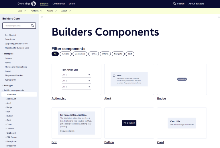
All the components are thoroughly documented. They ensure that Gjensidige can keep the corporate profile across all applications and websites in different regions. The components also help empower designers, UX professionals, and developers to speak in the same language.
Atomic Design Principles
The Gjensidige design system is based on the principles of atomic design. Thus, the first little thing is “atoms”—the tokens. Here Gjensidige places color styles, typography, shapes, and sizes in one package.
Gjensidige maintains other separate packages for icons and fonts. With these atoms, they build their components in React.
Further, the developers can use components within other components. For example, checkboxes can be reused in an input field. These more complex components are consequently called “molecules.” Together, the molecules make up an “organism,” which is essentially a part—an advanced component—in Enonic Content Studio.
All packages are versioned, and old versions are never removed. Editorial teams can in theory use the latter forever. When the developers release a new version, the different teams can upgrade at their own pace.
Editorial Content and React Applications
Content editors fill the input fields of each content item and part with appropriate content, and the React component is rendered with the content as React properties. Then the editors can easily rearrange and add parts using drag and drop to create the appropriate layout for any page type.
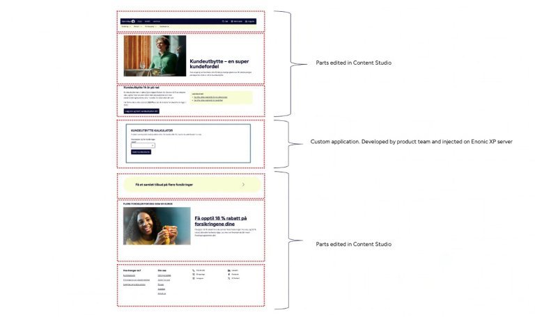
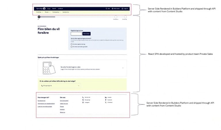
In the above example, the page is served by Enonic. It contains a combination of editorial parts from Builders Core and a React application developed by another project team. The React app is shipped to the Gjensidige CDN and then embedded on the Enonic page.
Although the page contains elements from different teams, it seamlessly fits together as all the Gjensidige developers are using components from the design system.
Above is a complete web application hosted and developed by the Gjensidige private sales team. They needed to ship their single-page applications, but still wanted to wrap those with the same navigation and footer used on the sites served by Enonic.
As Gjensidige ships the server-side rendered navigation and footer through an API, the private sales team can embed these elements on their site with the editorial content from Content Studio already in place.
Editorial Process
At Gjensidige, content design and user experience are intertwined with the daily use of Enonic's Content Studio, where the content designer collaborates closely with developers and UX designers to enhance both end-user and editor functionalities.
Content Studio's adaptability allows for personalized help texts and naming conventions, contributing to a coherent editing experience.
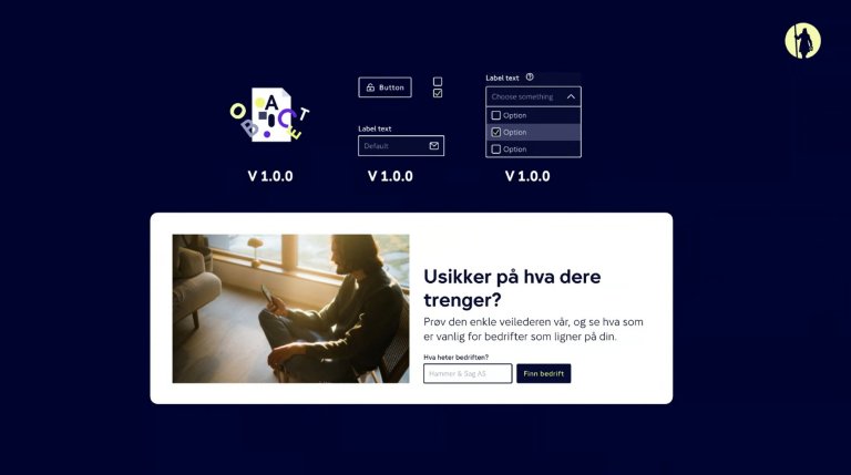
The integration between parts from Enonic and the design system allows for great usability. For instance, it is possible to insert small React applications as parts.
An example of this is the App Loader, which fetches a URL from Gjensidige’s CDN area, together with an ID and a class name. This can be used to add additional forms directly to product pages, while maintaining uniformity thanks to the design system.
Gjensidige fosters a trust-based, communicative environment. Documentation and best practices are therefore paramount for ensuring brand compliance when the editors enjoy “freedom with responsibility.”
Quality assurance is done through rigorous testing with intentionally bad examples like overlong titles, to root out potential problems. Regular meetings and communication tools like Slack are key to maintaining a culture of continuous learning and sharing among editors.
This shift from traditional content filling to content design has significantly reduced unregulated customizations. This illustrates the importance of structured training and dialogue in maintaining the integrity and effectiveness of content management within the Enonic platform.
Image Handling
Managing images at Gjensidige has evolved into a distinct process from its initial setup where all content, including large-sized images, was housed within a single Enonic instance. With the introduction of the brand boost initiative, a digital asset management system was incorporated.
Currently, Gjensidige operates an asset server split into two instances: one interfacing with the asset environment and another with the production environment.
This setup allows responsible personnel to optimize image sizes and other parameters before making them accessible to editors through parts that query the asset server.
Each Gjensidige member firm maintains control over its unique assets. Additionally, the Enonic content platform manages styling and aspect ratios.
Selected Content Types and Parts
Content Type: Product
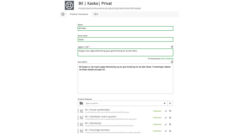
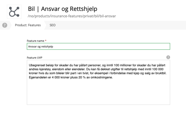
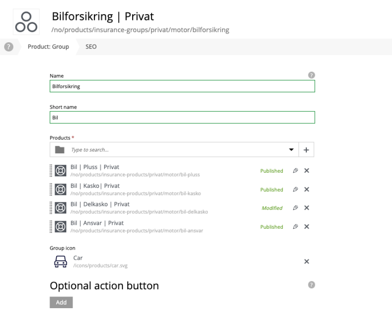
Digging deeper into the integration between Enonic and Builders Core, one finds specific content types and parts. Beginning with the content type “Product,” which includes fields that build up information about insurance and pension products in one place.
Gjensidige features several parts—with coherent design system elements—that can link to and show bits of information about the product. The editors then have to find the sweet spot between universal and specific data to be shown in various contexts.
Having one central source for the product, changes can be made once and be reflected across many pages displaying a portion of the data—thus saving both time and space. Additionally, “Product” is placed within a hierarchy:
- Product Group (e.g. vehicle, car, motorcycle, boat, truck)
- Product (e.g. car insurance)
- Product Features (e.g. coverage within a product, like roadside assistance, glass damage, engine failure)
Each content type contains a few fields, like “title,” “description,” and others. Parts on a page can fetch product groups, which fetch associated products, which again fetch relevant product features. This is done through the use of a ContentSelector field in the part, where editors choose the appropriate content types.
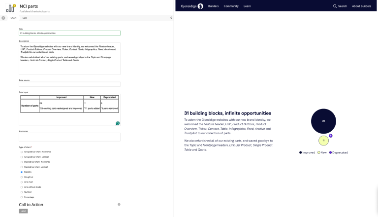
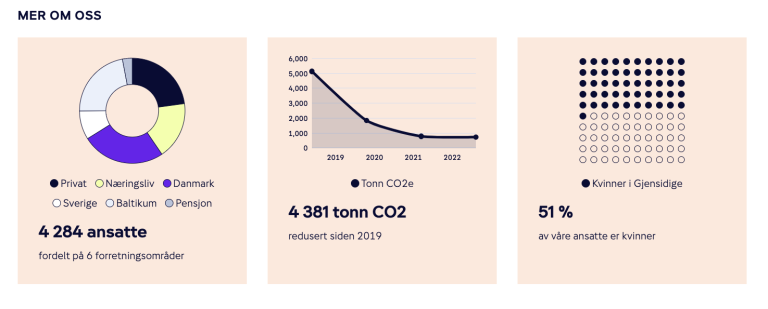
Content Type: Chart
Another relevant content type and associated part is “Chart,” tailored for generating dynamic infographics. This content type empowers editors to transform tabular data into visually appealing charts directly within the CMS. The process begins with a rich text field with a simple table. The table is capable of producing one to three distinct chart types.
The design system plays a crucial role, pulling in predefined colors and graphic elements to ensure each chart aligns with Gjensidige’s visual identity. With a default table complete with generic examples, editors can swiftly create new infographics without starting from scratch each time, streamlining the content creation process.
This efficient model not only conserves space but also exemplifies the seamless integration of CMS functionalities into the design system. Through this approach, the essential building blocks like tokens and design principles flow from the design system and enhance the CMS’s capability to produce content-driven visualizations.
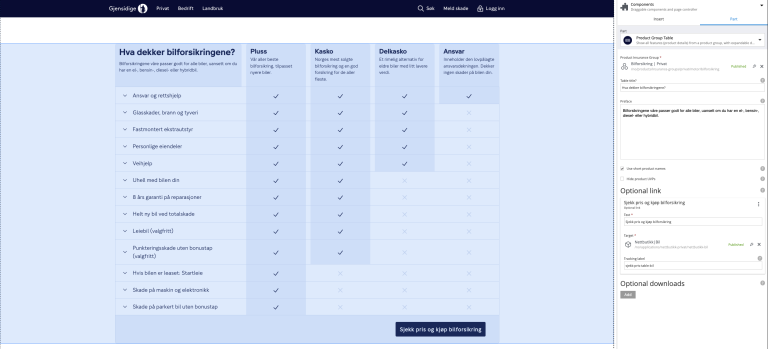
Part: Comparison Table
The part “comparison table” does exactly what its name implies: it compares products—an example being car insurance. The thoroughly UX tested part fetches design and components from the design system, but with the flexibility to tweak certain elements. The goal, however, is to use the part as much as possible out of the box.
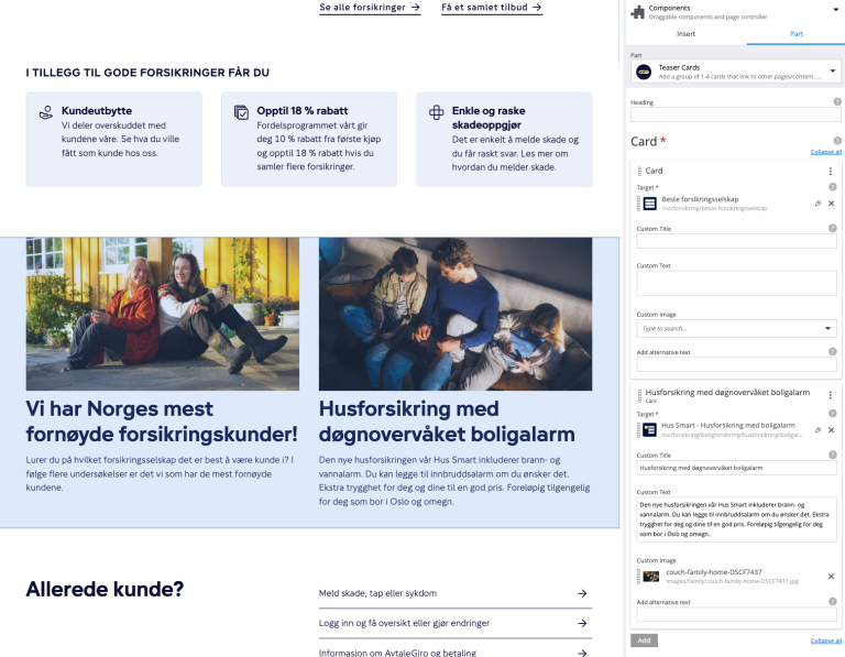
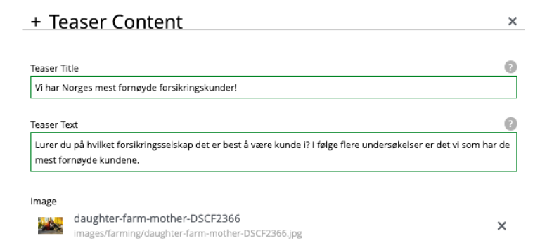
Part: Teaser Card
One of the most used parts is the “teaser card,” a simple part with a focus on visuals and an editorial call to action that acts as a basic entry to articles and product pages.
The teaser card part extracts x-data fields with teaser content from a content item of the content type “page.” A content editor can place the teaser card part on a new page, and include x-data from e.g. “car Insurance.” This automatically retrieves info from x-data on the page for car insurance.
When content editors create a new page, they are focused on and familiar with the specific content. The best practice is consequently to fill in the x-data at the same time, making it ready to be retrieved by the part and the design it fetches from the design system.