Websites: past and present
What did websites look like 20 and 30 years ago? See a comparison of old and new, and learn how to dig up fossils.
Written by Vegard Ottervig on
It’s quite humorous to look at drawings and photographs from days of yore and see the fashion, culture, and styles now long gone. This doesn’t just apply to clothing and physical things. Ever since the first web page went live in 1991, the web has undergone tremendous change.
In this article we will take a closer look at the essential development of websites from 1991 and up until today. We will also compare new and old of some famous websites, as well as teach you how you can discover old versions. Finally we will indicate where we’re going next.
A brief history of web design
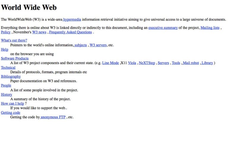
The first web page was published on 6 August 1991 by Tim Berners-Lee of the European Organization for Nuclear Research, more commonly known as CERN. The web page included information on the World Wide Web and outlined formats, protocols, and how you could create web pages.
The address was http://info.cern.ch/hypertext/WWW/TheProject.html and in 1992 it looked like this:
The early web pages were largely text-based, as the internet connections were slow and the technology limited. No special design or page structure was present, but the basic HTML tags for headers, paragraphs, and links made their debut.
Mid-90s: Tables and colors
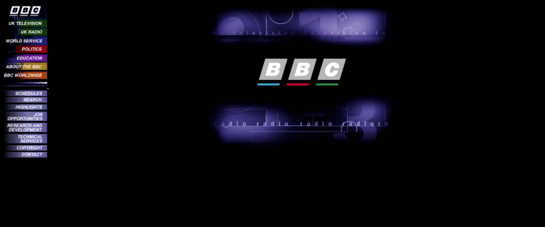
Fast forward to 1996, the happy days when DVDs launched in Japan, Spice Girls conquered the world and aliens tried to conquer the world in Independence Day. Things had definitely changed since 1991, as the homepage of BBC illustrates:
Gone were the plain texts and layouts of the first websites, and instead we got colors, table-based layouts, flashy GIFs, and website counters. Although websites later moved away from table-based design, the idea of structure continued.
Late 90s: The web and Flash
The late 90s introduced a new innovation: Flash. Growing impatient with the lack of support for animation and video on the web, Macromedia attempted to hijack the web with the introduction of Flash technology.
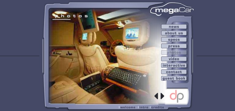
While Flash isn’t web, the tech nonetheless introduced web designers to an entire new world of possibilities to “augment” their table designs—including splash plages, 3D buttons, colour-changing navigation, and more, well, flashy elements.
Kim Dotcom’s data security company Megacar.com is a point in case:
Flash came with serious shortcomings, however, including not being searchable. Flash also caused slow loading times, as users had to run an application in the web browser. When the web finally acquired support for animations and video, Flash died rather quickly.
Early 2000s: CSS
The early 2000s saw the influx of CSS, enabling the separation of content and design. To see what we mean, visit CSS Zen Garden and view the same content in different designs.
Content could be created independently of design, and vice versa, making websites easier to maintain with less code and complexity.
Mid-2000s: Web 2.0
While the term “web 2.0” might be unclear, it may be used to refer to the growth of multimedia applications, interactive content, and the introduction of social media platforms. All of these features started to gain prominence from around 2005 and onwards, and marked the definitive death of Flash.
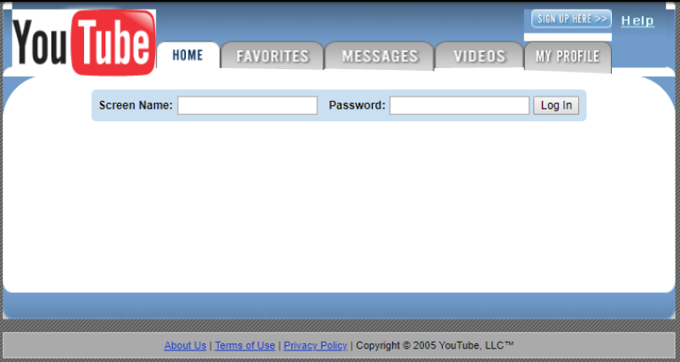
“Web 2.0” introduced more JavaScript functionality in the web browser, as well as Ajax technology—which downloads and refreshes parts of a website. Now the web went from being static HTML to function more like the web we’re familiar with today. Greater attention were paid to typography, whitespace, color palette, user experience, and SEO. 2005 also saw the launch of YouTube:
Websites today
Further innovations in technologies like HTML5, CSS3, and JavaScript have enabled more advanced and complex websites than before—further emphasized by the addition of mobile and apps.
Similarly, by analyzing the best manufacturing websites, one can observe how increased awareness about UX, content strategies, and SEO has influenced modern web designs, leading to minimalist graphics, flat design, blended typography, and more.
The history of websites and web design is an oscillation between content and presentation, where content was first the dominant part, before a period where designers went bananas with Flash and tables, and finally the trend turned back to leverage content again.
This fiery relationship is still going strong, with the addition of multichannel complexity, structured content, well-defined website structure, headless CMS, and powerful front-end frameworks like Next.js to the mix.
Comparisons: Then and now
Nothing is more striking than a “before and after” comparison. To really get a grip of how much the web has evolved, let’s take a look at some famous brands and their respective websites at different times.
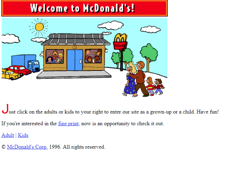
McDonalds.com in 1996:
McDonald’s in 2022:
BBC in 1997:
BBC in 2022:
Google in 1998:
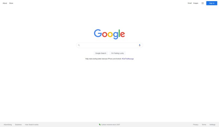
Google in 2019:
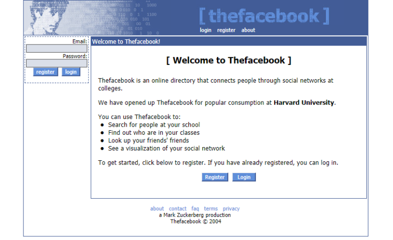
Facebook in 2004:
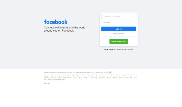
Facebook in 2019:
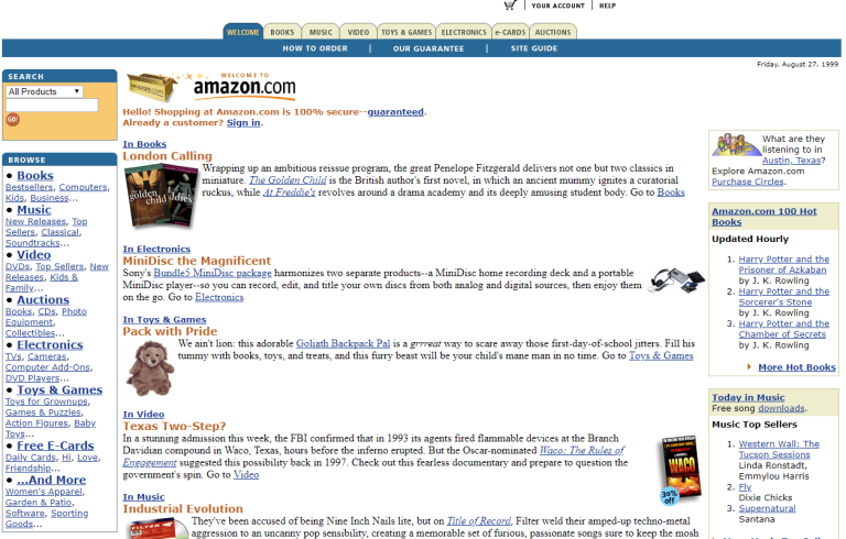
Amazon in 1999:
Amazon in 2019:
Build websites with the newest tools: headless CMS and Next.js »
How to time travel
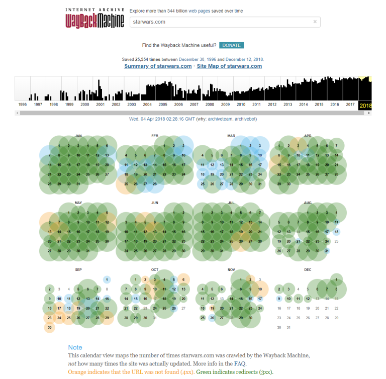
There are some tools that allow you to retrieve old versions of your favourite websites. The most famous of these is the Wayback Machine from the Internet Archive. Just type in your preferred URL and see snapshots way back to the mid 90s in some cases.
With the Wayback Machine you can explore more than 344 billion web pages that have been saved over time, but bear in mind that the service doesn’t include every website that have existed. Sometimes it also shows snapshots with missing image files or missing Flash animations, thus not providing a completely accurate view of the past.
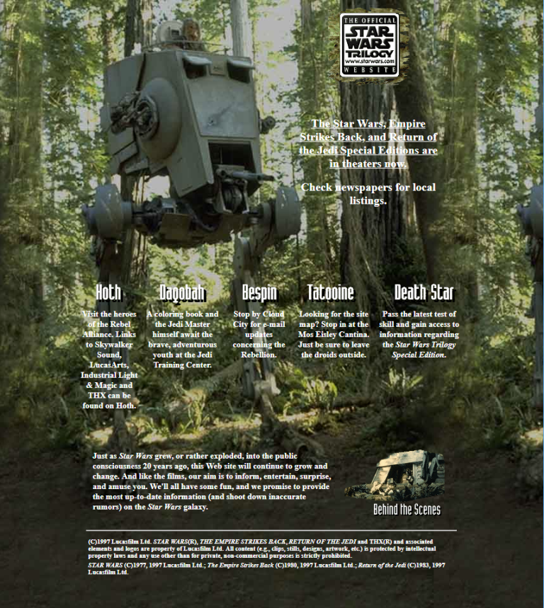
Another tool is oldweb.today. This service is based on the Wayback Machine, but adds the twist of seeing the old web pages through an emulated web browser, like Internet Explorer 4.0 or Netscape Navigator 4.08.
If you really want to save a current web page for posterity, enter it and save it through the browser to your local hard drive. This will store image files, style files, HTML files, and more on your computer, ensuring a faithful rendition of the page locally.
Where are we headed next?
The World Wide Web has changed dramatically since the first web page went online in 1991. From primitive text documents through flashy color explosions to the modern websites of today, the website has finally found a balance between content and design, and is now ready for the days to come.
Although it’s impossible to predict the future, the trend is fairly clear for where we’re headed next: The ascent of mobile, progressive web apps, omnichannel demand, and headless CMS and powerful front-end frameworks tells us a story of digital experiences with rich functionality in any channel, whether it be smart phones, tablets, wearables, IoT, digital signage, or the classical website.
We’ve had an exciting 30 years of web development—and it will be exciting to see what the next 30 years will bring.
First published 16 January 2019, updated 12 August 2022.

