Responsive content management – no longer a nightmare
Enonic provides a truly responsive content management experience wherever you are.
Written by Morten Eriksen on
Picture this. You’re on the bus, and your boss calls to ask you to make some important changes to your website, but you’ve only got your phone at hand to take care of the edits.
Nightmare scenario, right? You’ll have to pinch, zoom, drag and scroll your way around a tiny UI with fingers that suddenly seem horrendously large and unwieldy by comparison.
Inefficient, frustrating, and fraught with the risk of further errors are all things that jump to mind to describe this situation. In a world where seconds and minutes translate into dollars and cents, it shouldn’t be this hard to edit on the fly.
Well, the great news is that thanks to Enonic, it doesn’t have to be. The Enonic platform has been designed to prevent nightmare scenarios like this by providing a truly responsive content management experience, wherever you are.
No screen size left behind
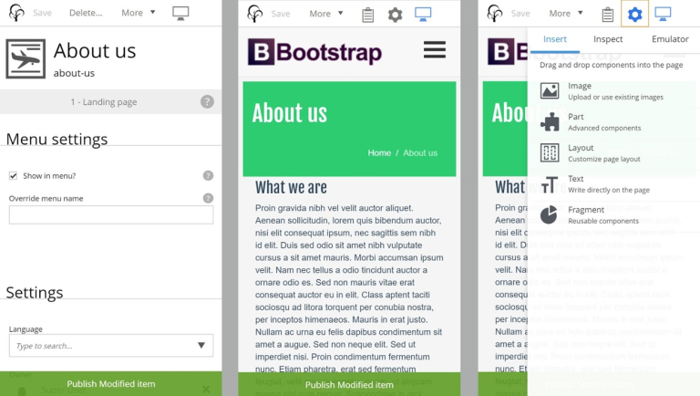
Sometimes changes need to happen ASAP, and in those situations, the only tool at your disposal may be a smartphone or a tablet. A CMS should be prepared for these scenarios, adapting its interface to all types of screen sizes or input methods, and optimizing its user experience to reflect the benefits and limitations of different platforms.
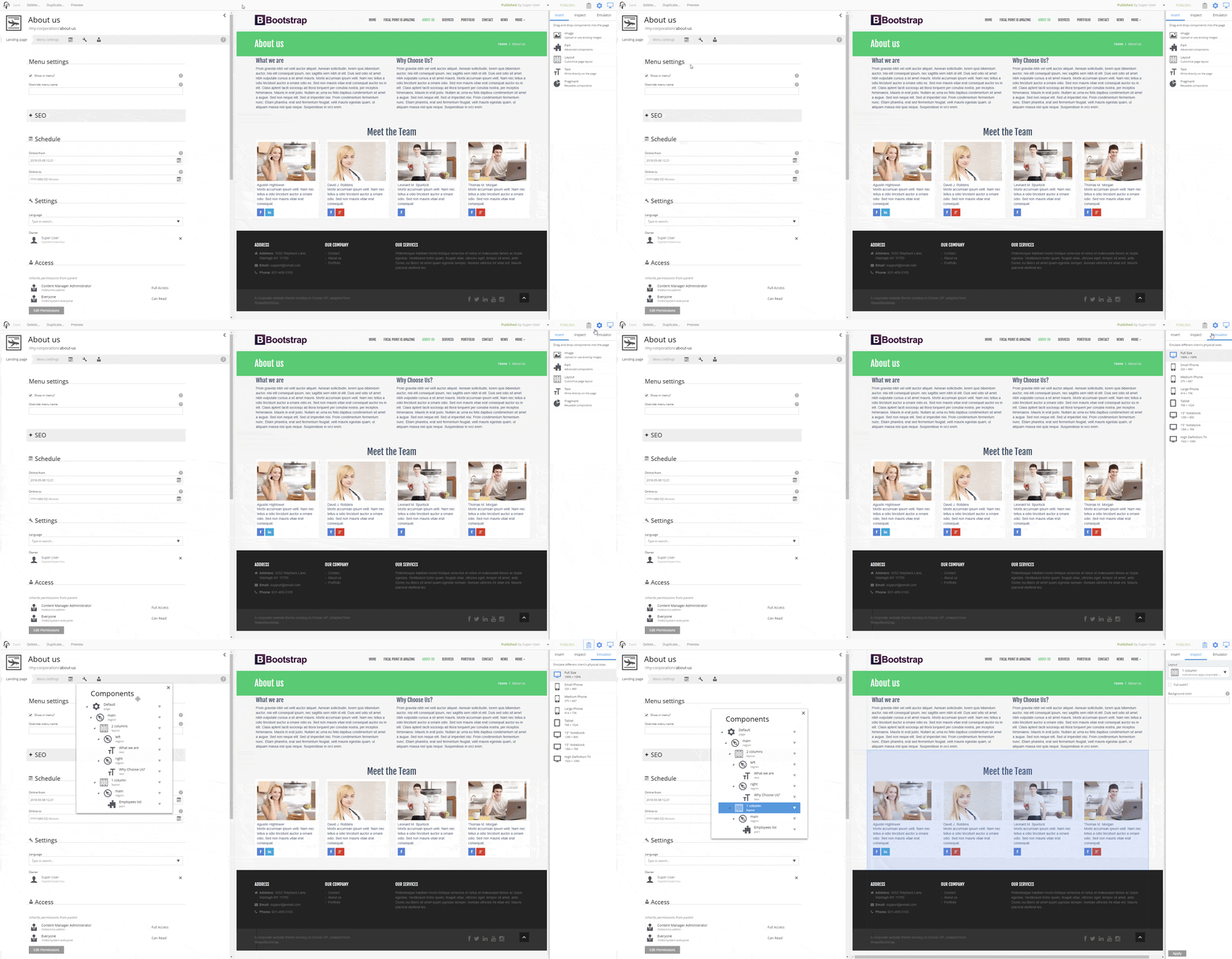
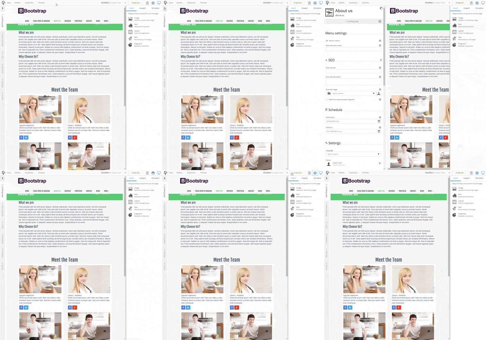
Enonic and its content management interface Content Studio allows users to interact with screens of all shapes and sizes. From ensuring responsive and smart layering of elements on small screens, to adding extra functionality and insight on large workstations.
Don’t waste screen real estate. CMS vendors should ensure that every inch of screen area is being used to its fullest, whether it’s a tiny mobile touch screen or a giant office based workstation.
The size of your device should feel like a force multiplier when using your CMS, and this means an experience that’s designed to take full advantage of all the space. Enonic does exactly this by scaling its user interface as screens get larger or smaller, and dynamically altering the panels.
Read more: 5 reasons to choose Enonic as your CMS
Edit content everywhere
Ah, bandwidth. The scourge of digital workers on the go everywhere. There’s nothing like having your attempts to review digital content slowed down to a crawl by limited bandwidth. A CMS that doesn’t take into account the fact that connection speeds are far less than ideal, isn’t a CMS you want to invest in.
Enonic optimizes its bandwidth usage to ensure that the interface loads quickly and reliably on even the slowest connections, freeing you to edit content whenever, and wherever, without a second thought.
Optimized mobile editing
As anyone who’s tried to use their smartphone for productivity will be able to tell you, working on mobile platforms is a whole different ball game. And often not a particularly fun one.
Mobile editing comes with a host of challenges, so it’s not enough that a CMS is responsive. Great CMS software thus goes all in on the mobile user experience, and Enonic has done exactly that. For example, in the absence of mouseover functionality, tapping is used to provide feedback to the user.
Touchscreen image handling
One of the most challenging aspects of managing content on a touch screen device is image handling. Cropping, for example, can’t work in the same way as on more traditional platforms with a cropping rectangle. Enonic and Content Studio optimize the image handling experience for touchscreen devices, allowing you to use gestures that come naturally to smartphone and tablet users, such as zoom and pan.
Enonic is a fully responsive and modern CMS that has been meticulously engineered to help you to quickly and reliably review and edit your content—regardless of your location or device. That means you can say farewell to tiny UI, offscreen elements, and clumsy touchscreen interactions for good.
First published 6 August 2018, updated 4 August 2022.

